www.bzintelguru.com
Thanks.
Monday, July 6, 2009
Thursday, May 14, 2009
Let's bar the pie chart, a response to Russ' JMP blog post
In a blog post on JMP, Russ Wolfinger makes a case for 3D pie charts over. His rational is this,
"It [the 3D pie chart] takes advantage of color, aggregation and 3-D aesthetics. The labels enable immediate identification with the data instead of forcing me to eyeball down to an X-axis and tilt the head to read them. In addition, blogosphere exigencies require omission of a critical feature: interactivity. It’s a spinnable graph that comes complete with slider bars that let you adjust degree of explosion and shininess. (Thanks to JMP experts Xan Gregg, who has written about 3-D pie charts in JMP, Craige Hales and David Barbour.) The ability to personally control the graph won me over. Graph B also appears to be better suited for rapid scan viewing as recommended by Bill Cleveland."
On aesthetics the 3D pie chart is hard to look at because it's unprofessional looking. The reflection of light off the pie pieces is silly, the thickness of the pie pieces is meaningless, and the bevel of the edge of the pie takes the cake. I feel bad for the graphics card that had to render all that junk. All of these things detract from the message that the poor pie chart is trying to convey.
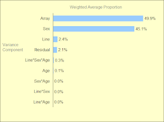
The label comparison problem on the bar chart can be easily fixed by flipping the chart, as I've done below.
As for interactivity, it's hard for me to image that consumers of the chart will want to play with it. What is more important is that the person presenting the graph take the time necessary to get it right, so that their audience doesn't need to spin it or alter it with sliders. As for the preparer needing sliders and spinners, perhaps that is useful, but on a pie chart? Doubtful.
So, here are the 3 charts.
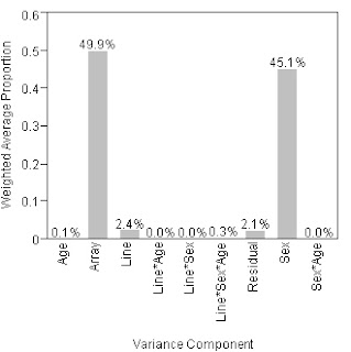
First, the bar chart that Russ doesn't like.

And here's his improved pie chart
Finally, my version of what his bar chart should look like

Tuesday, May 12, 2009
Shift Happens, updated
I stumbled across this an earlier verion of this video a few months ago. Now it's been updated.
I think this is a novel approach to info vis, basically well designed slides as a movie. How many stats from the movie do you remember?
Monday, May 4, 2009
Times Swine flu map-update
They added a time slider to the map, but kept the circles.
Related story in today's paper about how students at Northwestern are building a model using the physical path that dollars take, plus air traffic and commuter data, to predict the spread of the virus. So far, their predictions have been fairly close. They estimate, without the US taking preventative measures, a total of ~ 2,500 cases in the US. Not too bad in a country with 300,000,000 peeps.
Friday, May 1, 2009
NYTimes lame Swine Flu map
Check out the map the NYTimes put out showing where the swine flu has struck.
Typically, the GIS Team at the Times does great work with maps, using timeline sliders, and appropriate levels of granularity to best tell their story. This time, however, I think they've fallen short. First off, rather than using circles, which we all know are almost impossible to compare to one another, why not just fill in the states and countries with the appropriate color shades showing the number of cases? Or, better yet, go granular and show the data at county/province level.
Here's an old map from NYTimes showing state and county level voting results over time. You can select which view you want from the menus on the left side of the map. I think this approach would be better for the flu map, as there's a time component they could use to show the spread of the flu. In addition, the county/province level would provide a clearer picture of the exact places impacted by the flu. For example, in Mexico, are most of the cases in Mexico City, or some other part of the country?
Wednesday, April 8, 2009
Tuesday, April 7, 2009
Putting a scan to a face
Here's a link to a story about how putting a face on a CT
scan leads the people who review the scans to pay
more attention to them.
After months of reviewing CT scans with patient photos
on them, do the reviewers continue spending more time
on them? Or do they fall back to their previous levels?
Friday, April 3, 2009
Wednesday, March 4, 2009
Recession Geography story in NYTimes dated March 3rd
All of often we are fed statistics at too high a level. For example, unemployement in December 2008 stood at 7.1%. That's one statistic, but put the unemployment data on a county-level map, and you'll quickly see patterns across hundreds of counties in the US. Hardest-hit areas like California, the rustbelt, and parts of the South are highlighted in deep reds, whereas areas that are doing pretty well, like the North East and Mid section of the country are light orange.
New googlemap mashup
This is a pretty good mixture of google maps with apartment rental data. The map aspect of the tool let's you search within a radius of a chosen point. I'm surprised it took so long for someone to develop this when the most important thing in real estate is, location, location, location.
http://www.myapartmentmap.com/rentaldata/pa/doylestown/
http://www.myapartmentmap.com/rentaldata/pa/doylestown/
Thursday, February 26, 2009
Interactive Budgeting
I had a conversation today about making the city's budgeting process more accessible to the public, and was shown this link from the Kansas DOT as an example. I think it's pretty cool, and a type of tool that could be really useful in some of the conversations that are bound to happen more often as the economy struggles to get back on its feet.
What do you think works well? What would you change?
Wednesday, February 25, 2009
Attention all job seekers
Here's a writeup I found on mashable.com on the top 10 social sites for finding a job.
Tuesday, February 24, 2009
Stimulating comparisions of 2 Treemaps showing the stimulas package
Whose do you like better?
Hives
or
Juices
Is there a better way to summarize the 407 pdf detailing the plan?
BTW, Juice came out with their display first. I think it was released a couple of days ago, as part of their open source SDK, which is a great idea. I learned of Hive's implementation from a linkedin post.
Hives
or
Juices
Is there a better way to summarize the 407 pdf detailing the plan?
BTW, Juice came out with their display first. I think it was released a couple of days ago, as part of their open source SDK, which is a great idea. I learned of Hive's implementation from a linkedin post.
Tuesday, February 17, 2009
Story in today's NYTimes about the maps and cellphones
“I always said the next interface would be Quake,” said Steve Capps, one of the designers of the original Macintosh interface, referring to the popular video game. “How long will it be before you come out of the subway and you hold up your screen to get a better view of what you’re looking at in the physical world?”
http://www.nytimes.com/2009/02/17/science/17map.html?_r=1&8dpc
http://www.nytimes.com/2009/02/17/science/17map.html?_r=1&8dpc
Sunday, February 15, 2009
New book--How we decide
I heard the author of this book, Jonah Lehrer, on "Wait wait, don't tell me" the NPR news quiz last night. His book is filled with funny studies conducted on unsuspecting undergrads that show how irrational we are in much of our decision making.
Saturday, February 14, 2009
Hans Rosling on population growth
The Master Presenter is at it again. This time he's analyzing population growth. What do you think about the roving camera shots?
Thursday, February 12, 2009
Roll your own web aggregator
Pipes is a powerful and easy to use composition tool to aggregate, manipulate, and mashup content from around the web.
http://pipes.yahoo.com/pipes/
http://pipes.yahoo.com/pipes/
Wednesday, February 11, 2009
Jobs in Richmond, VA
More recruiters
Getting calls about openings in Richmond, VA. One for SunTrust bank. The other was not specific, but it's probably either also SunTrust, or Capital One. In any event, the non-specific one was posted on linkedin. You can find it here.
Will let you know when I know more, which should be tomorrow. BTW, I reread Advanta's rules on blogging. This blog should be ok, but I'm not allowed to update it from work, so keep that in mind when checking back.
SunTrust says they're looking to hire 20 "Analysts". This would be for the mortgage business, but I can tell you, it's not all that different than the work you've all done in SB credit cards.
Tuesday, February 10, 2009
Good article from today's NYTimes
Crunching data for the tree of life.
http://www.nytimes.com/2009/02/10/science/10tree.html
http://www.nytimes.com/2009/02/10/science/10tree.html
Monday, February 9, 2009
Recruiter for TechUSA
Hi all,
I met with a recruiter for TechUSA today, Drew Talone. Nice guy and seems like a go-getter. Suzannah, his company has a contract with NavTeq, and they're local. I told him about your good work and he said he'd love to speak to you.
His phone number is 610-897-2397, and his email address is, atalone@techusa.net. They also have their tentacles into pharma, financial services, and other fun arenas. Also, Mark S. is working with another one of their recruiters, Sean Healey.
Will keep my ears and eyes open should any other interesting things come my way.
Saturday, February 7, 2009
Hiring manager for Chase's Analytics group
I know the HR hiring manager for Chase's Analytic group. If you're interested in working in Wilmington, let me know and I'll make sure she gets your resume and a recommendation from me about you.
Thursday, February 5, 2009
The Visualizers
Hi Everyone--I thought I'd put a place together where we can keep up to date with everyone's goings ons. If anyone has a place they already like to hang out online, where we can form a group like this, please feel free to let us know.
Subscribe to:
Posts (Atom)
