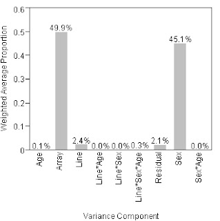
In a blog post on JMP, Russ Wolfinger makes a case for 3D pie charts over. His rational is this,
"It [the 3D pie chart] takes advantage of color, aggregation and 3-D aesthetics. The labels enable immediate identification with the data instead of forcing me to eyeball down to an X-axis and tilt the head to read them. In addition, blogosphere exigencies require omission of a critical feature: interactivity. It’s a spinnable graph that comes complete with slider bars that let you adjust degree of explosion and shininess. (Thanks to JMP experts Xan Gregg, who has written about 3-D pie charts in JMP, Craige Hales and David Barbour.) The ability to personally control the graph won me over. Graph B also appears to be better suited for rapid scan viewing as recommended by Bill Cleveland."
On aesthetics the 3D pie chart is hard to look at because it's unprofessional looking. The reflection of light off the pie pieces is silly, the thickness of the pie pieces is meaningless, and the bevel of the edge of the pie takes the cake. I feel bad for the graphics card that had to render all that junk. All of these things detract from the message that the poor pie chart is trying to convey.
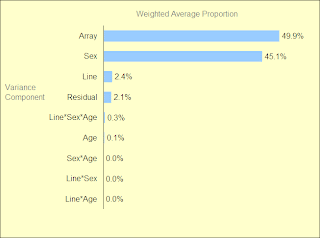
The label comparison problem on the bar chart can be easily fixed by flipping the chart, as I've done below.
As for interactivity, it's hard for me to image that consumers of the chart will want to play with it. What is more important is that the person presenting the graph take the time necessary to get it right, so that their audience doesn't need to spin it or alter it with sliders. As for the preparer needing sliders and spinners, perhaps that is useful, but on a pie chart? Doubtful.
So, here are the 3 charts.
First, the bar chart that Russ doesn't like.

And here's his improved pie chart
Finally, my version of what his bar chart should look like


No comments:
Post a Comment